# Configure dashboard layout
Use a cell grid when widgets need spans, packing and responsive columns. Use a split layout when panes need to cover the board and resize through dividers. The examples render three KPI cards, then add a section and a tab container without assembling groups or binding grids yourself.
The dashboard is data: widget specs describe the board, the diagram owns its live models, and the kit wires layout and gestures onto that same document.
Start in the project left by your [JavaScript](https://bench-grafloria-61d.atloria.app/p/bench-grafloria-61d-mQCmWpDrxv/developer/javascript-quick-start), [React](https://bench-grafloria-61d.atloria.app/p/bench-grafloria-61d-mQCmWpDrxv/developer/react-quick-start), [Vue](https://bench-grafloria-61d.atloria.app/p/bench-grafloria-61d-mQCmWpDrxv/developer/vue-quick-start), [Angular](https://bench-grafloria-61d.atloria.app/p/bench-grafloria-61d-mQCmWpDrxv/developer/angular-quick-start) or [Qwik quick start](https://bench-grafloria-61d.atloria.app/p/bench-grafloria-61d-mQCmWpDrxv/developer/qwik-quick-start). Keep the starter's entry wiring, stylesheet imports and configuration. The files below add dashboard content to that project.
## 1. Declare the grid and packing options
Use [`DashboardOptions`](https://bench-grafloria-61d.atloria.app/p/bench-grafloria-61d-mQCmWpDrxv/developer/grafloria-element-dashboard-kit-dashboardoptions) for board geometry and [`DashboardWidgetSpec`](https://bench-grafloria-61d.atloria.app/p/bench-grafloria-61d-mQCmWpDrxv/developer/grafloria-element-dashboard-kit-dashboardwidgetspec) for typed widget data. `widgets` declares a single unnamed view; `views` declares named boards instead. Do not supply both.
Add this file in every project. The built-in KPI renderer paints your labels and values; no custom widget component is needed. The initial board uses six columns, 10-pixel gaps, floating placement and a width-driven column count.
```ts title="src/dashboard-options.ts"
import type { DashboardOptions, DashboardWidgetSpec } from '@grafloria/element';
export function createOptions(): DashboardOptions {
const widgets: DashboardWidgetSpec[] = [
{
id: 'revenue', kind: 'kpi', title: 'Revenue', span: 2, rows: 1,
x: 0, y: 0, data: { label: 'Revenue', value: '$6.8M', delta: 12.4 },
},
{
id: 'customers', kind: 'kpi', title: 'Customers', span: 2, rows: 1,
x: 2, y: 0, data: { label: 'Customers', value: '1,284', delta: 8.1 },
},
{
id: 'orders', kind: 'kpi', title: 'Orders', span: 2, rows: 1,
x: 4, y: 0, data: { label: 'Orders', value: '312', delta: 5.2 },
},
];
return {
columns: 6,
gap: 10,
rowHeight: 96,
float: true,
responsive: { columnWidth: 120 },
dragHandle: true,
binder: { padding: 16, maxRows: 8 },
widgets,
};
}
```
The kit uses [`GridPackEngine`](https://bench-grafloria-61d.atloria.app/p/bench-grafloria-61d-mQCmWpDrxv/developer/grafloria-engine-layout-grid-pack#gridpackengine) to resolve cells, collisions and gravity. You do not instantiate it for a dashboard. Use the component's options and the live [`DashboardHandle`](https://bench-grafloria-61d.atloria.app/p/bench-grafloria-61d-mQCmWpDrxv/developer/grafloria-element-dashboard-kit-dashboardhandle) instead.
`binder` accepts extra [`DashboardGridOptions`](https://bench-grafloria-61d.atloria.app/p/bench-grafloria-61d-mQCmWpDrxv/developer/grafloria-element-dashboard-kit-dashboardgridoptions). Here `padding` separates the outer frame from the cells, while `maxRows` supplies a grid row bound. The kit applies its view geometry after these extras: configure columns, sizing, row height, design height, float, overflow and responsive columns through the dashboard options rather than relying on `binder` to override them. For a nested section's designed row count, put `maxRows` on that section, as in the next example.
## 2. Mount the board and switch grid, split, fit and grow
Use [`dashboard`](https://bench-grafloria-61d.atloria.app/p/bench-grafloria-61d-mQCmWpDrxv/developer/grafloria-element-dashboard-kit-functions#dashboard) with [`render`](https://bench-grafloria-61d.atloria.app/p/bench-grafloria-61d-mQCmWpDrxv/developer/grafloria-element-core#render) in JavaScript. In React, use [`GrafloriaDashboard`](https://bench-grafloria-61d.atloria.app/p/bench-grafloria-61d-mQCmWpDrxv/developer/grafloria-react#grafloriadashboard); in Vue, use [`GrafloriaDashboard`](https://bench-grafloria-61d.atloria.app/p/bench-grafloria-61d-mQCmWpDrxv/developer/grafloria-vue#grafloriadashboard); in Qwik, use [`GrafloriaDashboard`](https://bench-grafloria-61d.atloria.app/p/bench-grafloria-61d-mQCmWpDrxv/developer/grafloria-qwik#grafloriadashboard). Angular exposes [`GrafloriaDashboardComponent`](https://bench-grafloria-61d.atloria.app/p/bench-grafloria-61d-mQCmWpDrxv/developer/grafloria-angular-components-grafloriadashboardcomponent).
The quick starts already install the binding and its peers. These samples import no additional package.
For the framework examples, add the component below and render it from your existing root component or route. Add its import without removing the starter's existing imports or providers. In Angular, add `DashboardLayoutComponent` to the root component's `imports` and use ``. In React, Vue and Qwik, render ``. JavaScript changes the quick start's entry file and keeps its stylesheet import.
:::code-group
```ts title="JavaScript"
// src/main.ts
import './style.css';
import { dashboard, render } from '@grafloria/element';
import { createOptions } from './dashboard-options';
const app = document.querySelector('#app');
if (!app) throw new Error('Missing #app');
app.innerHTML = `
{ handle.value = noSerialize(ready); }}
style={{ height: '480px', width: '100%' }} />
);
});
```
:::
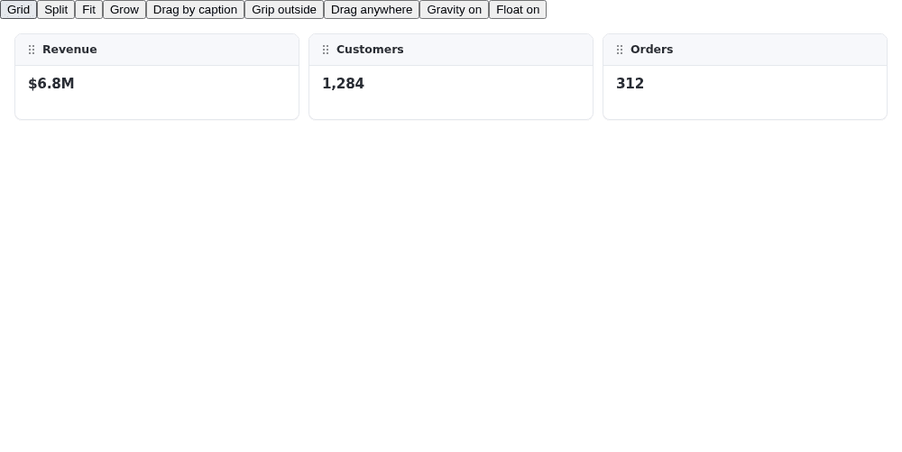
The Vue component renders the same cards and controls.
You see Revenue, Customers and Orders in the grid. Press **Split** to turn their cells into a splitter tree. The panes cover the board; drag a divider to change their proportions. Press **Grid** to snap that tree back to cells. The framework bindings apply these switches to the live handle, not by remounting the board.
In grid layout, **Fit** keeps the board height and squeezes rows. **Grow** keeps the 96-pixel row height and extends the board downward. Split layout always fits, regardless of the grid sizing setting. **Gravity on** packs tiles upward; **Float on** leaves them where you drop them.
**Drag by caption** limits dragging to the header strip. **Grip outside** changes that zone to a painted grip at the top-right edge; select a card to see its grip. **Drag anywhere** restores whole-card dragging. Resize edges and the keyboard remain independent of the drag handle.
Compare the switches in the [Fluid dashboard demo](https://grafloria.com/demos/dashboard/fluid-board.html).
## Dashboard containers
A widget carrying `widgets` is a section with its own inner board. A widget carrying `layout: 'tabs'` is a tab container: its children carrying `widgets` are pages, and only the active page is visible. This differs from dashboard-level views, where only one whole board is on-camera.
1. Replace `src/dashboard-options.ts` with the file below. It uses [`DashboardViewSpec`](https://bench-grafloria-61d.atloria.app/p/bench-grafloria-61d-mQCmWpDrxv/developer/grafloria-element-dashboard-kit-interfaces#dashboardviewspec) to declare the main board, [`SectionCaptionOptions`](https://bench-grafloria-61d.atloria.app/p/bench-grafloria-61d-mQCmWpDrxv/developer/grafloria-element-dashboard-kit-sectioncaptionoptions) to style the section band and [`TabsOptions`](https://bench-grafloria-61d.atloria.app/p/bench-grafloria-61d-mQCmWpDrxv/developer/grafloria-element-dashboard-kit-tabsoptions) to style the page strip.
2. Keep the mounting code from step 2 in your framework. Every tab imports the same `createOptions()` function, so the board now mounts the nested data instead of the three-card grid.
3. Open **Alerts** in the side panel to switch its page. The Operations caption belongs to its section, not to either KPI inside it.
```ts title="src/dashboard-options.ts"
import type {
DashboardOptions, DashboardViewSpec, SectionCaptionOptions, TabsOptions,
} from '@grafloria/element';
export function createOptions(): DashboardOptions {
const caption: SectionCaptionOptions = {
text: 'Operations',
subtitle: 'Today',
font: { size: 12, weight: 700, transform: 'uppercase' },
background: '#e8ecfb',
border: '1px solid #3b52d9',
margin: [2, 4],
};
const tabs: TabsOptions = { stretch: true, height: 36 };
const views: DashboardViewSpec[] = [{
id: 'main', name: 'Overview', widgets: [
{
id: 'ops', title: 'Operations', span: 4, rows: 3,
x: 0, y: 0, columns: 2, maxRows: 2, stack: true, caption,
widgets: [
{
id: 'orders', kind: 'kpi', span: 2, rows: 1,
data: { label: 'Orders', value: '312', delta: 5.2 },
},
{
id: 'churn', kind: 'kpi', span: 2, rows: 1,
data: { label: 'Churn', value: '1.9%', delta: -0.3 },
},
],
},
{
id: 'side', title: 'Side panel', span: 2, rows: 3,
x: 4, y: 0, layout: 'tabs', active: 'filters', tabs,
widgets: [
{
id: 'filters', title: 'Filters', columns: 2, widgets: [
{
id: 'region', kind: 'kpi', span: 2, rows: 1,
data: { label: 'Region', value: 'EMEA' },
},
],
},
{
id: 'alerts', title: 'Alerts', columns: 2, widgets: [
{
id: 'open', kind: 'kpi', span: 2, rows: 1,
data: { label: 'Open alerts', value: '3' },
},
],
},
],
},
],
}];
return {
columns: 6,
gap: 10,
width: 960,
height: 480,
sizing: 'grow',
rowHeight: 96,
autoHeight: true,
overflow: 'scroll',
nesting: 3,
dragHandle: { grip: true, position: 'right', placement: 'outside' },
views,
};
}
```
You see the Operations section beside the Filters/Alerts tab container. `stack: true` makes Operations a list: its children pack upward in order, including the held tile. A drop below the last child lands immediately after it. `maxRows: 2` is its inner designed row count; a child pulled past that bound can grow the section's slab in its parent. Set the section's `sizing: 'fit'` when the pane itself must remain the bound.
The explicit `width` selects fixed mode: the authored 960 × 480 world is framed into the host. Remove `width` for a fluid board that follows its container at CSS-pixel scale. `autoHeight` measures painted widget content and rounds its height up to rows only where the board can grow by content. It skips containers, fit views, split layouts, tab pages and fit sections, including children inside those contexts. Here Operations can size its KPI children by content, but Region and Open alerts retain their authored row spans inside the tab pages. Use a smaller `rowHeight` when you need finer content-height increments.
Keep the tab container as `tabs`; switch the layout **inside a page** with `handle.setLayout('split', 'filters')`, or inside the section with `handle.setLayout('split', 'ops')`. `handle.getLayout(id)` reports `grid`, `split` or `tabs`. `activateTab('side', 'alerts')` selects a page from code and returns `false` when either id does not identify the required container or page.
See the [Dashboard containers demo](https://grafloria.com/demos/dashboard/nested-containers.html) for cross-boundary placement, and its [Angular data-first example](https://github.com/grafloria/grafloria/blob/5c0b626b42b8ca8ae6de46c7962cf0e8c78fda63/apps/demos-angular/src/app/demos/dashboard-containers/dashboard-containers.component.ts) for the section declaration pattern.
## Options that change the layout
Defaults below are the dashboard kit's defaults, not the standalone grid binder's defaults.
| Option | Type | Default | What it does |
| --- | --- | --- | --- |
| `layout` | `'grid' \| 'split'` | `'grid'` | Grid packs cells; split covers the board with proportional panes and always fits. |
| `mode` | `'fluid' \| 'fixed'` | `'fluid'`; explicit `width` implies `'fixed'` | Fluid follows the host at zoom 1; fixed frames an authored world. |
| `sizing` | `'fit' \| 'grow'` | `'grow'` in fluid mode; `'fit'` in fixed mode | Fit keeps the frame; grow keeps the row height. |
| `columns` | `number` | `12` | Declared column count; also the responsive maximum unless overridden. |
| `gap` | `number` | `8` px | Widget gap and board padding; `binder.padding` overrides padding independently. |
| `width`, `height` | `number` | `1180`, `660` px | Authored board dimensions for fixed mode. |
| `rowHeight` | `number` | `130` px | Row height in grow mode. |
| `float` | `boolean` | `false` | False enables upward gravity; true retains drop positions. |
| `overflow` | `'bounded' \| 'scroll'` | `'bounded'` | Bounded fit refuses growth beyond capacity; scroll extends the frame past the row floor. |
| `squeeze` | `boolean` | `true` | In bounded fit, true shrinks rows toward the floor before refusing growth; false freezes the current row height. |
| `static` | `boolean` | `false` | True removes pointer dragging, resizing and handles; API edits still work. |
| `rtl` | `boolean` | `false` | True renders column zero at the right edge without changing saved cells. |
| `nesting` | `number` | Unbounded | Deepest board a drop may enter; a view has depth zero. |
| `autoHeight` | `boolean` | `false` | Content-driven height for widgets that do not override it, outside fit views, split layouts, tab pages and fit sections. Containers ignore it. |
### Responsive columns
`responsive: { columnWidth: 120 }` derives `round(boardWidth / 120)` columns, clamped between one and the maximum. Alternatively, use `responsive: { breakpoints: [{ w: 480, c: 1 }, { w: 900, c: 4 }] }`: the first breakpoint whose width is at least the board width supplies the count. Beyond all breakpoints, the maximum applies. Breakpoints take precedence when both forms are present.
The binder re-evaluates when the board frame or canvas container changes; do not add a resize listener. Narrowing caches the layout it leaves, so widening restores the wide layout. `handle.setColumns(n)` also uses that cache, but explicitly pins the count and stops responsive evaluation from overriding it. `handle.getColumns()` reads the live count.
The [Dashboard grid options demo](https://grafloria.com/demos/dashboard/grid-options.html) shows the responsive cache, explicit cell placement, bounded sections, pinned tiles, gravity and RTL together.
### Caption and grip choices
[`DragGripOptions`](https://bench-grafloria-61d.atloria.app/p/bench-grafloria-61d-mQCmWpDrxv/developer/grafloria-element-dashboard-kit-interfaces#draggripoptions) configures the painted grip. `dragHandle` accepts these forms:
| Value | Drag zone |
| --- | --- |
| `false` | Whole card; the default. |
| `true` | Caption/header strip. |
| A selector string | Your matching element inside the card. |
| `{ grip: true }` | Painted grip; `position` is `left`, `center` or `right` (default `left`), and `placement` is `inside` or `outside` (default `inside`). |
For a section's `caption`, omit it or pass `false` for no band, `true` for its title, a string for text, or an options object for styling. `setCaption(id, caption)` changes the band live as one undo step; `getCaption(id)` reads it.
| Caption choice | Values and effect |
| --- | --- |
| `position` | `inside` is a full-width band; `tab` is a text-sized chip at the leading corner. Both reserve space inside the section. |
| `align` | `start`, `center`, `end`; default `start`, mirrored in RTL. |
| `valign` | `top`, `center`, `bottom`; default `center`. |
| `show` | `always` paints and reserves the band; `design` omits it under static mode; `hover` overlays content without a reserve. Default `always`. |
| `font.transform` | `none` or `uppercase`. |
`text` defaults to the section title. `subtitle` adds a second line; `font`, `background` and `border` style the band. `margin` adds space between band and frame and increases the reserve. Caption actions call `onCaptionAction` instead of selecting the section; buttons and inputs in the band remain content.
For tab strips, `position` accepts only `top`. `align` accepts `start`, `center` and `end`, defaulting to `start`; `stretch` shares the strip width equally. `hidden: true` removes the strip and its reserve, so switch pages with `activateTab()` instead of pointer interaction.
## Integrate layout with an existing document
Use `handle.refresh()` after loading cells directly into the live model. It re-reads the boards and projects those cells into widget positions. Layout switches and history changes already synchronize the kit; they need no extra refresh call.
Use [`bindDashboardGrid`](https://bench-grafloria-61d.atloria.app/p/bench-grafloria-61d-mQCmWpDrxv/developer/grafloria-element-dashboard-kit-functions#binddashboardgrid) when you already have a diagram group and want to attach grid packing to its members. This is the group-level integration path, not an extra binder to add to a board mounted with `dashboard()` or a dashboard component. One binder owns one group's grid.
The browser sample below mounts both paths: the KPI board loads Orders into the second row, and an existing Sales group gets a six-column grid with two three-column tiles. Add these files to your JavaScript quick-start project; keep its existing entry code and stylesheet imports. The Close integration button disposes both views.
```ts title="src/layout-integration.ts"
import { bindDashboardGrid, dashboard, render } from '@grafloria/element';
import { createOptions } from './dashboard-options';
export function mountLayoutIntegration(host: HTMLElement): () => void {
const dashboardHost = document.createElement('div');
dashboardHost.style.height = '480px';
const groupHost = document.createElement('div');
groupHost.style.height = '320px';
host.append(dashboardHost, groupHost);
const spec = dashboard(createOptions());
const board = render(spec, dashboardHost);
const orders = board.getModel().getNode('orders');
if (!orders) throw new Error('Missing Orders widget');
// Load persisted cell intent before presenting the board for editing.
orders.setGridItem({
columnStart: 1, columnEnd: 3, rowStart: 2, rowEnd: 3,
});
spec.handle.refresh();
const diagram = render({
nodes: [
{ id: 'sales-orders', label: 'Orders', position: { x: 8, y: 8 },
size: { width: 268, height: 110 } },
{ id: 'sales-revenue', label: 'Revenue', position: { x: 284, y: 8 },
size: { width: 268, height: 110 } },
],
groups: [{ id: 'sales-grid', label: 'Sales',
children: ['sales-orders', 'sales-revenue'],
bounds: { x: 0, y: 0, width: 560, height: 240 } }],
}, groupHost);
const model = diagram.getModel();
const group = model.getGroup('sales-grid');
if (!group) throw new Error('Missing Sales group');
group.position = { x: 0, y: 0 };
group.size = { width: 560, height: 240, depth: 0 };
for (const id of ['sales-orders', 'sales-revenue']) {
const node = model.getNode(id);
if (!node) throw new Error(`Missing ${id}`);
node.setMetadata('columnSpan', 3);
node.setMetadata('rowSpan', 1);
node.setBehavior({ connectable: false });
for (const port of node.getPorts()) node.removePort(port.id);
}
const grid = bindDashboardGrid(diagram, group, {
columns: 6, gap: 8, sizing: 'grow', baseRowHeight: 110,
designHeight: 240,
});
return () => {
grid.dispose();
diagram.dispose();
spec.handle.dispose();
board.dispose();
dashboardHost.remove();
groupHost.remove();
};
}
```
```ts title="src/main.ts (additions)"
import { mountLayoutIntegration } from './layout-integration';
const integration = document.createElement('section');
const closeIntegration = document.createElement('button');
closeIntegration.textContent = 'Close integration';
document.body.append(closeIntegration, integration);
const disposeIntegration = mountLayoutIntegration(integration);
closeIntegration.addEventListener('click', () => {
disposeIntegration();
integration.remove();
closeIntegration.remove();
}, { once: true });
```
## Pitfalls and related tasks
- Split layout always fits. A stored grid `grow` setting takes effect again when you return to grid.
- A bounded fit board can refuse a drop, resize or `addWidget()` that needs another row. `addWidget()` returns `undefined` when there is no room. Existing excess content squeezes into the bounded frame rather than scrolling.
- Explicit `width` selects fixed mode. Omit it when you expect the board to follow the host's width.
- The host still needs a resolved height; see [Nest containers and lanes](https://bench-grafloria-61d.atloria.app/p/bench-grafloria-61d-mQCmWpDrxv/developer/nest-containers) for wrapper sizing.
- Use [Build a dashboard](https://bench-grafloria-61d.atloria.app/p/bench-grafloria-61d-mQCmWpDrxv/developer/build-dashboard) for widget content and application controls, [Build a Kanban board](https://bench-grafloria-61d.atloria.app/p/bench-grafloria-61d-mQCmWpDrxv/developer/build-kanban-board) for list workflows, and [Save and restore documents](https://bench-grafloria-61d.atloria.app/p/bench-grafloria-61d-mQCmWpDrxv/developer/save-and-restore) for persistence rather than saving a projection of selected spec fields.