# Angular: templates and handles
Use projected Angular templates when a node or dashboard widget needs your own HTML, bindings or controls. The examples below render two connected cards, then a two-view dashboard with a custom note and a shipped KPI painter. Your template paints inside a box; the engine and renderer still own its position and geometry.
In your Angular application, install the binding and its peers. Use Angular 18.1 or a supported major from 19 through 22.
```bash
npm install @grafloria/angular @angular/common @angular/core @angular/forms @angular/platform-browser @grafloria/engine @grafloria/renderer rxjs @grafloria/element
```
## 1. Project typed and wildcard node templates
Import both [`DiagramCanvasComponent`](https://bench-grafloria-61d.atloria.app/p/bench-grafloria-61d-mQCmWpDrxv/developer/grafloria-angular-components-diagramcanvascomponent#diagramcanvascomponent) and [`GrafloriaNodeDefDirective`](https://bench-grafloria-61d.atloria.app/p/bench-grafloria-61d-mQCmWpDrxv/developer/grafloria-angular-core#graflorianodedefdirective). A `grafloriaNode="ticket"` template matches the node's `type` exactly. In controlled mode that match opts the spec into HTML rendering without a `custom` flag.
A bare `grafloriaNode` is the wildcard fallback, not an opt-in: set `custom: true` on an unmatched spec to send it to the HTML layer. Exact templates take precedence.
The controlled data below adds template matching, wildcard opt-in and named ports; see [Angular: state and tooling](https://bench-grafloria-61d.atloria.app/p/bench-grafloria-61d-mQCmWpDrxv/developer/angular-state-and-tooling) for typing arrays with [`NodeSpec`](https://bench-grafloria-61d.atloria.app/p/bench-grafloria-61d-mQCmWpDrxv/developer/grafloria-renderer-instance-nodespec#nodespec), [`EdgeSpec`](https://bench-grafloria-61d.atloria.app/p/bench-grafloria-61d-mQCmWpDrxv/developer/grafloria-renderer-instance-edgespec#edgespec), [`NodeModel`](https://bench-grafloria-61d.atloria.app/p/bench-grafloria-61d-mQCmWpDrxv/developer/grafloria-engine-models-nodemodel#nodemodel) and [`LinkModel`](https://bench-grafloria-61d.atloria.app/p/bench-grafloria-61d-mQCmWpDrxv/developer/grafloria-engine-models-linkmodel#linkmodel).
The [`GrafloriaNodeTemplateContext`](https://bench-grafloria-61d.atloria.app/p/bench-grafloria-61d-mQCmWpDrxv/developer/grafloria-angular-core#graflorianodetemplatecontext) supplies the live model as `let-node`, its payload as `let-data="data"`, and the engine as `let-engine="engine"`. Read payload keys with index syntax.
### Attach HTML connection handles
Import [`GrafloriaHandleDirective`](https://bench-grafloria-61d.atloria.app/p/bench-grafloria-61d-mQCmWpDrxv/developer/grafloria-angular-core#grafloriahandledirective) and use its declared selector, `grafloriaHandle="source"` or `grafloriaHandle="target"`. Put it inside the node template. The canvas wrapper supplies the ancestor `data-node-id` that the directive uses to register the element; destruction unregisters it.
This browser component renders “Review login” through the typed template and “Release” through the wildcard. Each card has an HTML handle, and the edge names the corresponding port ids. The CSS places the handles at the same sides as the declared ports.
```ts title="ticket-board.component.ts"
import { Component } from '@angular/core';
import {
DiagramCanvasComponent,
GrafloriaHandleDirective,
GrafloriaNodeDefDirective,
} from '@grafloria/angular';
import type { LinkModel, NodeModel } from '@grafloria/engine';
import type { EdgeSpec, NodeSpec } from '@grafloria/renderer';
@Component({
selector: 'app-ticket-board',
standalone: true,
imports: [DiagramCanvasComponent, GrafloriaNodeDefDirective, GrafloriaHandleDirective],
template: `
{{ data['title'] }}
Assigned to {{ data['assignee'] }}
{{ data['title'] }}
{{ node.id }}
`,
styles: [`
.card { position:relative; width:100%; height:100%; box-sizing:border-box;
padding:16px; border:2px solid #6478d3; border-radius:10px;
background:white; color:#243047; font:14px system-ui; }
.fallback { border-color:#059669; }
.handle { position:absolute; top:50%; width:12px; height:12px;
border:2px solid white; border-radius:50%; background:#334155;
transform:translate(-50%, -50%); cursor:crosshair; }
.output { left:100%; } .input { left:0; }
`],
})
export class TicketBoardComponent {
nodes: readonly (NodeSpec | NodeModel)[] = [
{
id: 'review', type: 'ticket', position: { x: 60, y: 100 },
size: { width: 220, height: 110 },
data: { title: 'Review login', assignee: 'Nour' },
ports: [{ id: 'out', side: 'right', type: 'output' }],
},
{
id: 'release', type: 'release', custom: true,
position: { x: 420, y: 100 }, size: { width: 180, height: 110 },
data: { title: 'Release' },
ports: [{ id: 'in', side: 'left', type: 'input' }],
},
];
edges: readonly (EdgeSpec | LinkModel)[] = [
{ id: 'review-release', source: 'review', target: 'release',
sourceHandle: 'out', targetHandle: 'in' },
];
}
```
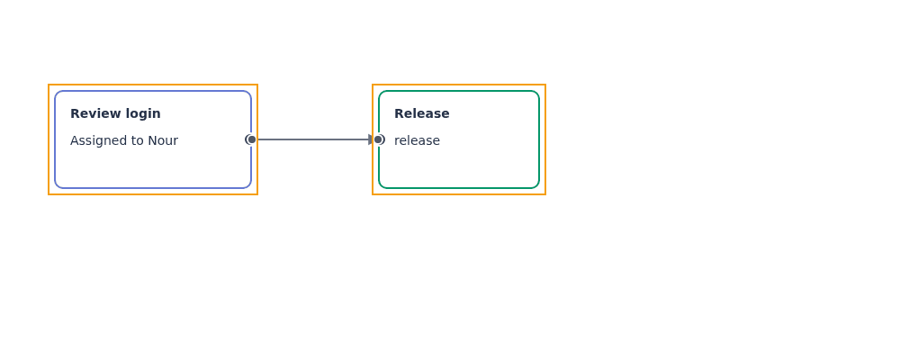
Render `` in your application's template after importing `TicketBoardComponent` into its standalone host. Both cards occupy their spec's `size`; their roots fill those boxes rather than determining the node dimensions.
For standard handles, omit the hand-painted spans and keep the `ports` declarations: the canvas already renders HTML connection handles for ports when its visibility policy allows them. Use your own handle elements when you need different HTML or styling, not a separate registry implementation.
## 2. Render widget templates and switch dashboard views
Use [`GrafloriaDashboardComponent`](https://bench-grafloria-61d.atloria.app/p/bench-grafloria-61d-mQCmWpDrxv/developer/grafloria-angular-components-grafloriadashboardcomponent#grafloriadashboardcomponent) for cells and packing rather than free-positioned graph nodes. Import [`GrafloriaWidgetDefDirective`](https://bench-grafloria-61d.atloria.app/p/bench-grafloria-61d-mQCmWpDrxv/developer/grafloria-angular-components-classes#grafloriawidgetdefdirective) alongside it. A widget's `kind` selects the matching template; without a match or wildcard, the component uses the shipped KPI, line, bar, donut, funnel or table painter.
The [`GrafloriaWidgetTemplateContext`](https://bench-grafloria-61d.atloria.app/p/bench-grafloria-61d-mQCmWpDrxv/developer/grafloria-angular-components-interfaces#grafloriawidgettemplatecontext) exposes the widget spec as `let-widget` and its payload as `let-data="data"`. The template root fills the widget cell.
This component opens Overview with a KPI and an Angular note. Click Operations to see the second view. `[(activeView)]` connects the tab property to the mounted board; `[layout]` and `[sizing]` switch live through the component.
### Save and reopen a snapshot
`snapshot()` returns a [`DashboardSnapshot`](https://bench-grafloria-61d.atloria.app/p/bench-grafloria-61d-mQCmWpDrxv/developer/grafloria-element-dashboard-kit-types#dashboardsnapshot), or `null` before the board is live. It contains widget layouts and board options from the handle's `toJSON()`. The sample displays the saved JSON and retains the snapshot in memory.
> **Known issue:** The snapshot clears only `renderWidget` and `onLayoutChange`; other function options, such as `onSelect`, `renderCaption`, `onCaptionAction` and `onTabChange`, remain in memory. For JSON persistence, serialize with `JSON.stringify()`, which drops function-valued properties, and supply your callbacks again when mounting.
The snapshot does not save widget selection or the view's scroll/camera position. Reopening restores the widget layouts and board options, but selection is lost and `showView()` reframes the chosen view rather than restoring its previous camera position.
The intended restore is to assign `saved.views` to `[views]` and `saved` to `[options]`.
> **Known issue:** Changing `[views]` or `[options]` does not rebuild an already mounted dashboard: the component reads them only in `ngAfterViewInit()`. Until it is fixed, unmount the board and mount it again with the snapshot inputs.
Click Save snapshot, then Close board, then Reopen saved board. The separate close and reopen actions let Angular destroy the old component before creating the restored one. Templates remain declared in your application; they are not stored in the JSON.
```ts title="notes-dashboard.component.ts"
import { Component, viewChild } from '@angular/core';
import {
GrafloriaDashboardComponent,
GrafloriaWidgetDefDirective,
} from '@grafloria/angular';
import type { DashboardSnapshot } from '@grafloria/element';
@Component({
selector: 'app-notes-dashboard',
standalone: true,
imports: [GrafloriaDashboardComponent, GrafloriaWidgetDefDirective],
template: `
@if (mounted) {
{{ data['text'] }}
}
}
`,
styles: [`
.note { height:100%; box-sizing:border-box; padding:20px;
background:#fffbeb; color:#78350f; font:16px system-ui; }
pre { max-height:200px; overflow:auto; }
`],
})
export class NotesDashboardComponent {
board = viewChild(GrafloriaDashboardComponent);
mounted = true;
dirty = false;
tab: string | undefined = 'overview';
layout: 'grid' | 'split' = 'grid';
sizing: 'fit' | 'grow' = 'fit';
saved: DashboardSnapshot | null = null;
savedText = '';
options: DashboardSnapshot = { columns: 12, gap: 8, views: [] };
views: DashboardSnapshot['views'] = [
{ id: 'overview', name: 'Overview', widgets: [
{ id: 'orders', kind: 'kpi', span: 6, rows: 1,
data: { label: 'Orders', value: '128', delta: 8 } },
{ id: 'review-note', kind: 'note', span: 6, rows: 1,
data: { text: 'Review the weekly order report.' } },
] },
{ id: 'operations', name: 'Operations', widgets: [
{ id: 'operations-note', kind: 'note', span: 12, rows: 1,
data: { text: 'Prepare the release checklist.' } },
] },
];
save(): void {
const snapshot = this.board()?.snapshot();
if (!snapshot) return;
this.saved = snapshot;
this.savedText = JSON.stringify(snapshot, null, 2);
this.dirty = false;
}
reopen(): void {
if (!this.saved || this.mounted) return;
this.views = this.saved.views;
this.options = this.saved;
this.mounted = true;
}
}
```
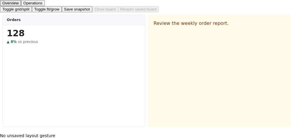
Render `` in your standalone host after importing `NotesDashboardComponent`. For imperative controls, `(ready)` supplies a typed [`DashboardHandle`](https://bench-grafloria-61d.atloria.app/p/bench-grafloria-61d-mQCmWpDrxv/developer/grafloria-element-dashboard-kit-dashboardhandle#dashboardhandle); `getHandle()` returns the same live handle, or `undefined` before the first paint. For layout autosave, `(layoutChange)` supplies `{ viewId, widgets }` after committed gestures.
A bare `` handles every kind without an exact template, including built-in kinds. Leave it out when you want unmatched KPIs and charts to use the shipped painters, as this sample does.
## Options that matter
| Option | Type | Default | What it does |
|---|---|---|---|
| `grafloriaNode` | `string` | `''` | Selects a node type; empty string is the HTML-layer fallback. |
| `grafloriaWidget` | `string` | `''` | Selects a widget kind; empty string is the unmatched-kind fallback. |
| `grafloriaHandle` | `'source' \| 'target'` | Required | Marks an output or input HTML handle. |
| `handleId` | `string` | Generated | Identifies a handle within its node. Pass an explicit id for named connections. |
| `handlePosition` | `'top' \| 'right' \| 'bottom' \| 'left'` | `'right'` | Records the connection side; position the element with your CSS. |
| Dashboard `activeView` | `string \| undefined` | `undefined` | Selects the on-camera view; two-way binding reflects the boot view when unset. |
| Dashboard `layout` | `'grid' \| 'split' \| undefined` | `undefined` | Overrides options at mount and changes every view's layout live. |
| Dashboard `sizing` | `'fit' \| 'grow' \| undefined` | `undefined` | Overrides options at mount and changes sizing live. Split layout uses fit sizing. |
| Dashboard `static` | `boolean \| undefined` | `undefined` | Overrides options at mount; `true` disables drag, resize and handles. |
## Pitfalls
- Import each template directive in the component that declares the template. An attribute without its directive does not register a template.
- An explicit `custom: false` overrides an exact node-template match. Live models pass through without the spec's automatic opt-in rewrite.
- Keep handles inside a node wrapper. Without an ancestor `data-node-id`, registration stops with a console warning.
- Widget templates mount once per widget; the host is reused across renders. Put ongoing data flow in your widget's Angular bindings or child components, not in an expectation that the dashboard re-stamps the template every frame.
- Bind either dashboard `views` or `widgets`, not both.
- For canvas sizing, see [Theme a canvas](https://bench-grafloria-61d.atloria.app/p/bench-grafloria-61d-mQCmWpDrxv/developer/theme-a-canvas). For explicitly rerunning graph layout, see [Lay out a diagram](https://bench-grafloria-61d.atloria.app/p/bench-grafloria-61d-mQCmWpDrxv/developer/lay-out-a-diagram).
## Live demos and related guides
- [Custom nodes demo](https://grafloria.com/demos/nodes/custom-nodes.html) — custom bodies with connected edges.
- [Typed ports demo](https://grafloria.com/demos/ports/typed-ports.html) — connection validation; see [Validate port connections](https://bench-grafloria-61d.atloria.app/p/bench-grafloria-61d-mQCmWpDrxv/developer/validate-port-connections) for the rules.
- [Dashboard builder demo](https://grafloria.com/demos/dashboard/dashboard-builder.html) and [source](https://github.com/grafloria/grafloria/blob/cccb505e76c7af26c8bafecaba8146db7d8df928/demos/dashboard/dashboard-builder.html) — widget templates, tabs and board controls.
- [Angular: state and tooling](https://bench-grafloria-61d.atloria.app/p/bench-grafloria-61d-mQCmWpDrxv/developer/angular-state-and-tooling) — controlled bindings and component methods.
- [Build a dashboard](https://bench-grafloria-61d.atloria.app/p/bench-grafloria-61d-mQCmWpDrxv/developer/build-a-dashboard) — board data and layout options.